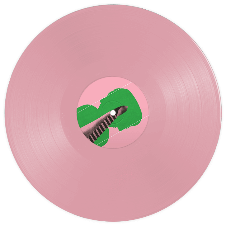

Record Store boasts to be "the best record emporium on the good ol' web" and they emerged as an oasis for music fans unable to find their latest fix on the highstreet in 1998. Specialising in the best new bands and the cream of established alternative artists, they became one of the leading online music retailers in the UK. Their demographic leans toward artists in the unconventional and underground genres, including Cigarettes After Sex, The Specials, Fontaines D.C., JOHN, Murder Capital, Thom Yorke and Neneh Cherry.
Did you know? The vinyl record market is propped up by “superfans” which accounts for 2/3 of all vinyl sales.
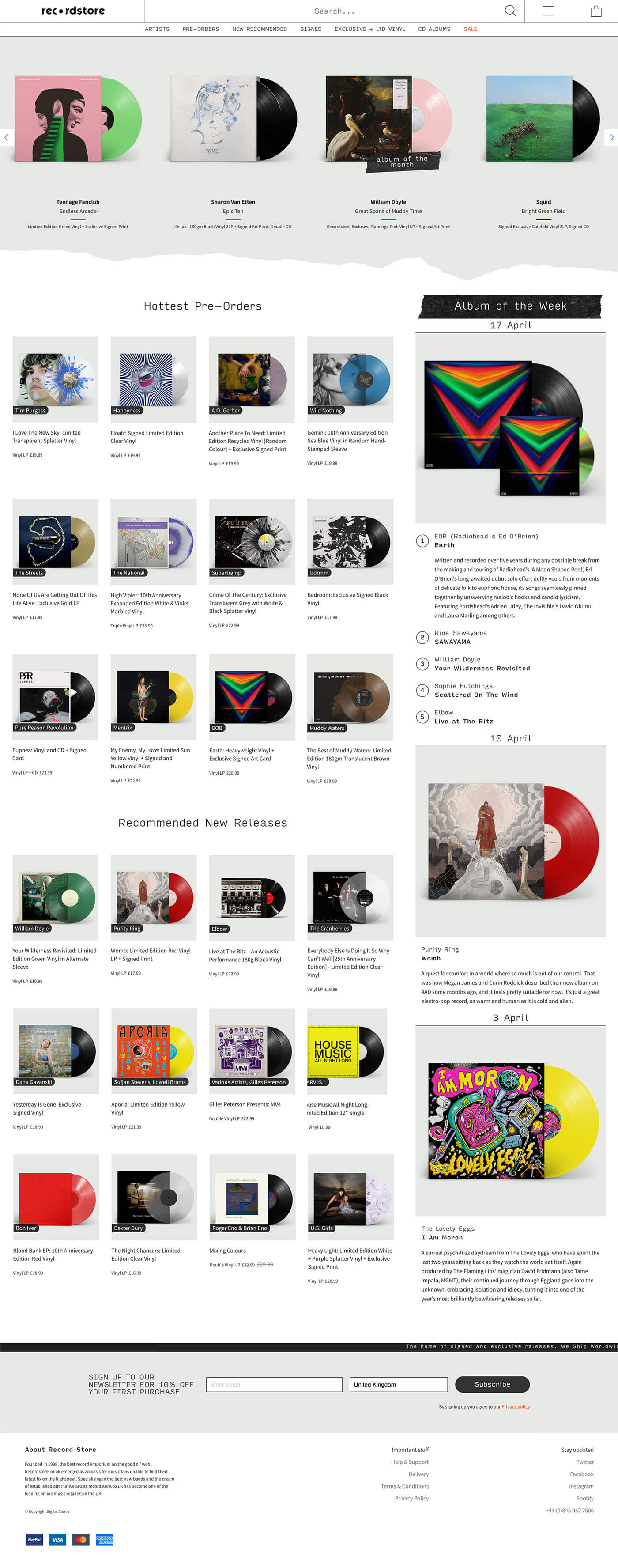
As the online store has not been loved or maintained for over 5 years, some areas of the previous design and features were beginning to look and feel outdated. Usability wise, it served its purpose in selling music, and excels in terms of product range. On top of that, they are excellent at email curation which is its main source of conversion.
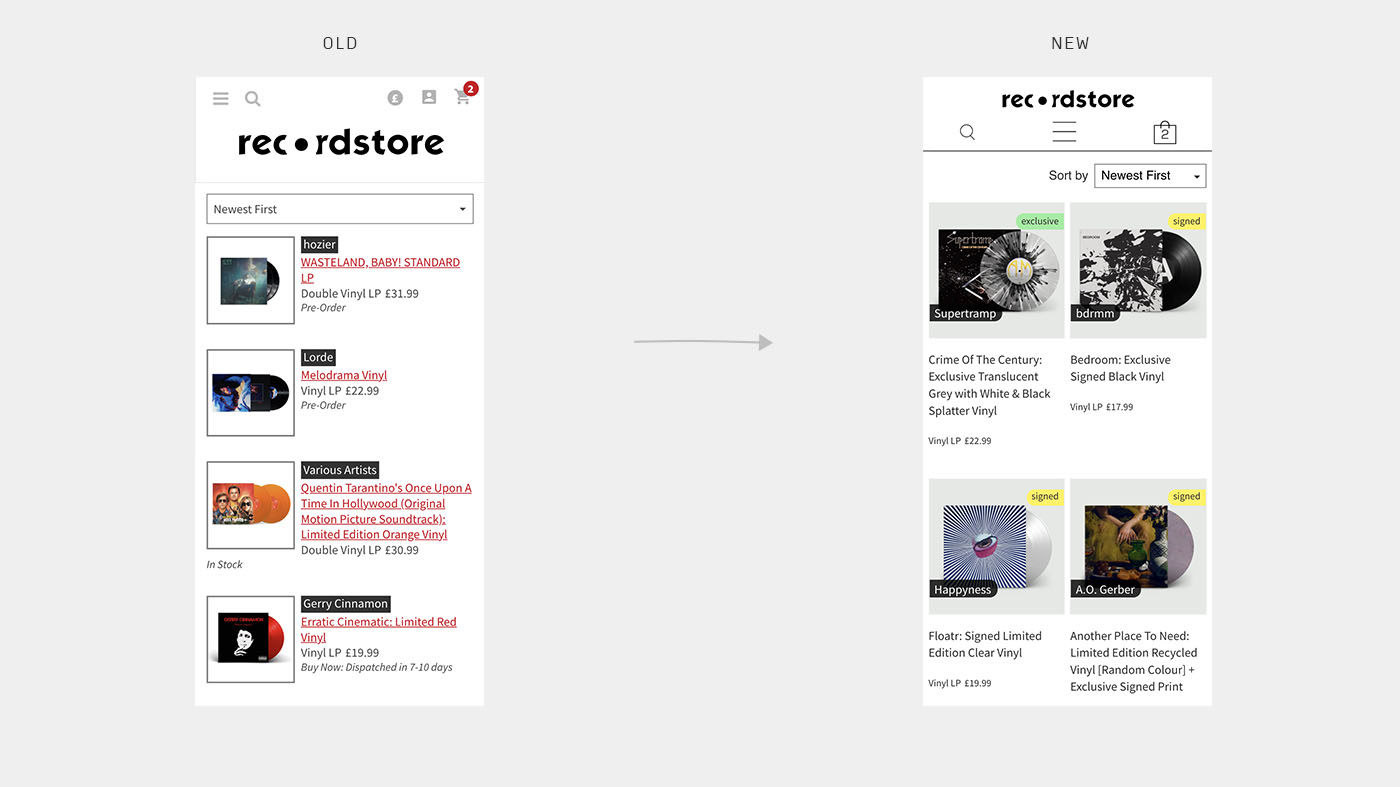
There were two parts to the project; refreshing the brand to create a cohesive system with character which works across all media types (which isn’t included in this particular case study), and updating the website to compete with other online physical music sellers. Another important factor is the shift to mobile visitors and consumers, so we need to optimise the mobile layout for key pages, such as the product list and product page.
The difficulty is in finding the balance of tweaking and improving weak areas of the current design, versus a complete overhaul. For this instance, we took an iterative approach, aiming to build a solid foundation first before considering nice-to-haves.
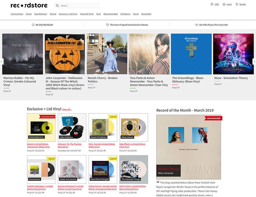
Overall, the old homepage layout served their audience well so it makes sense to maintain some continuity to avoid needlessly disrupting the current user flow. For this iteration, we will focus on improving the navigation which appears across the online store.
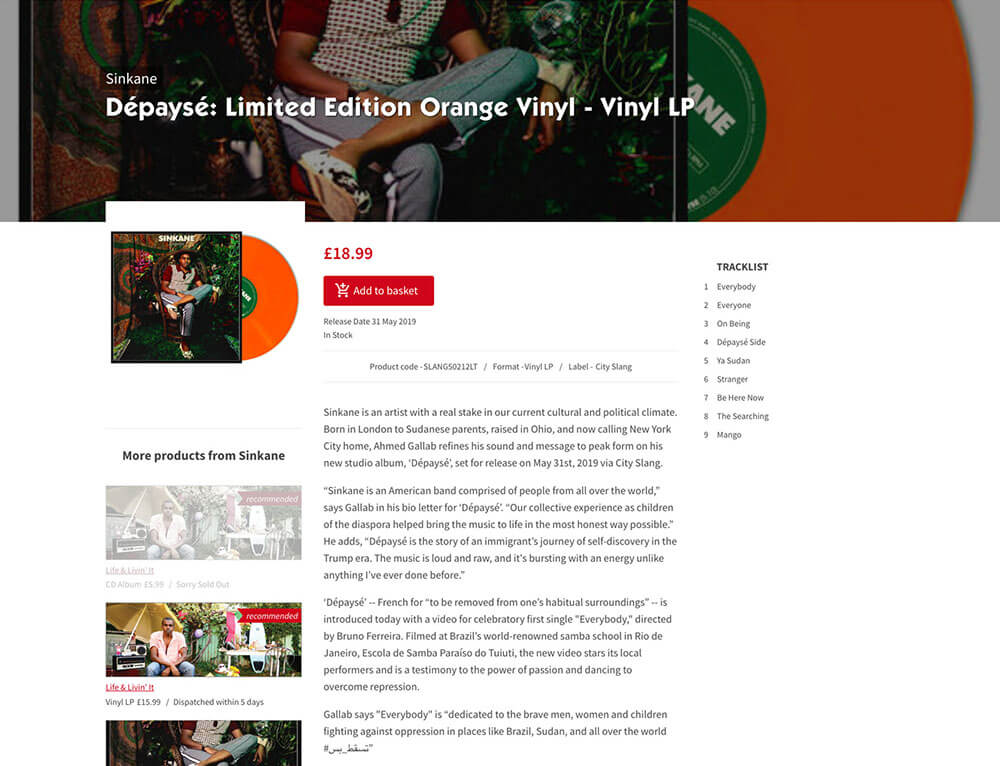
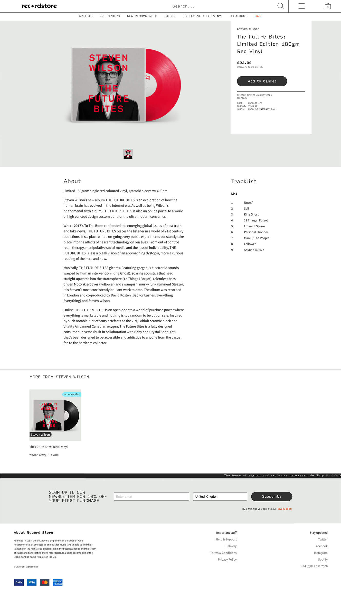
The product page was also one of our focus points when it came to the redesign to drastically improve content hierarchy and clarity of text and imagery.
We'll revise the layout so heads aren't being cropped.
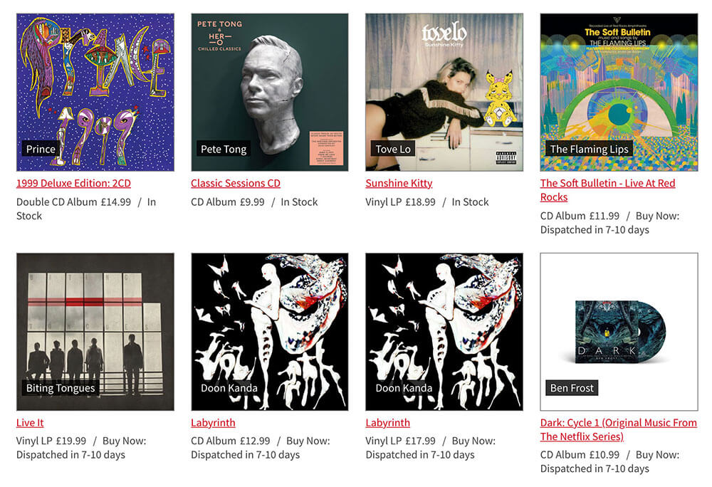
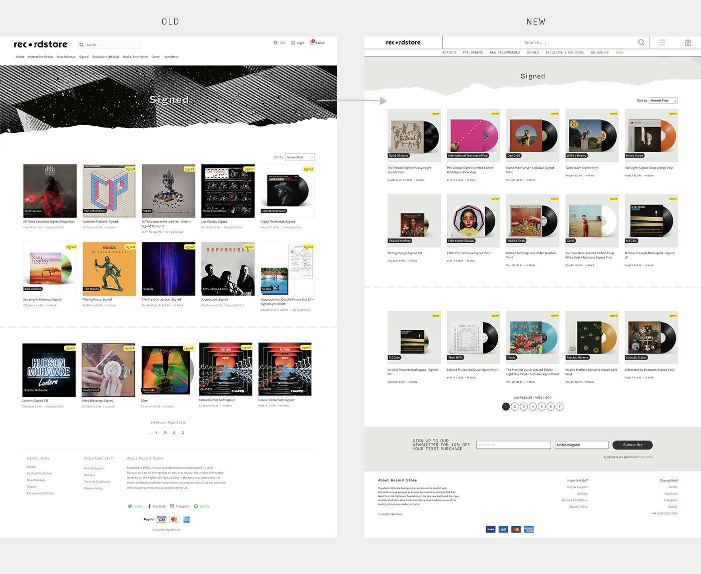
The original layout already follows the conventional product list layout in rows and columns of 3-4 on desktop, so the issue for these pages lies with the inconsistent use of product images. With a multitude of background colours, perspectives, and duplication scattered across the page, we needed a solution to unify the images. The result should aim to provide better visual cues for users to quickly identify the format of the item, for example, cassette tape, vinyl, double, LP or CD.
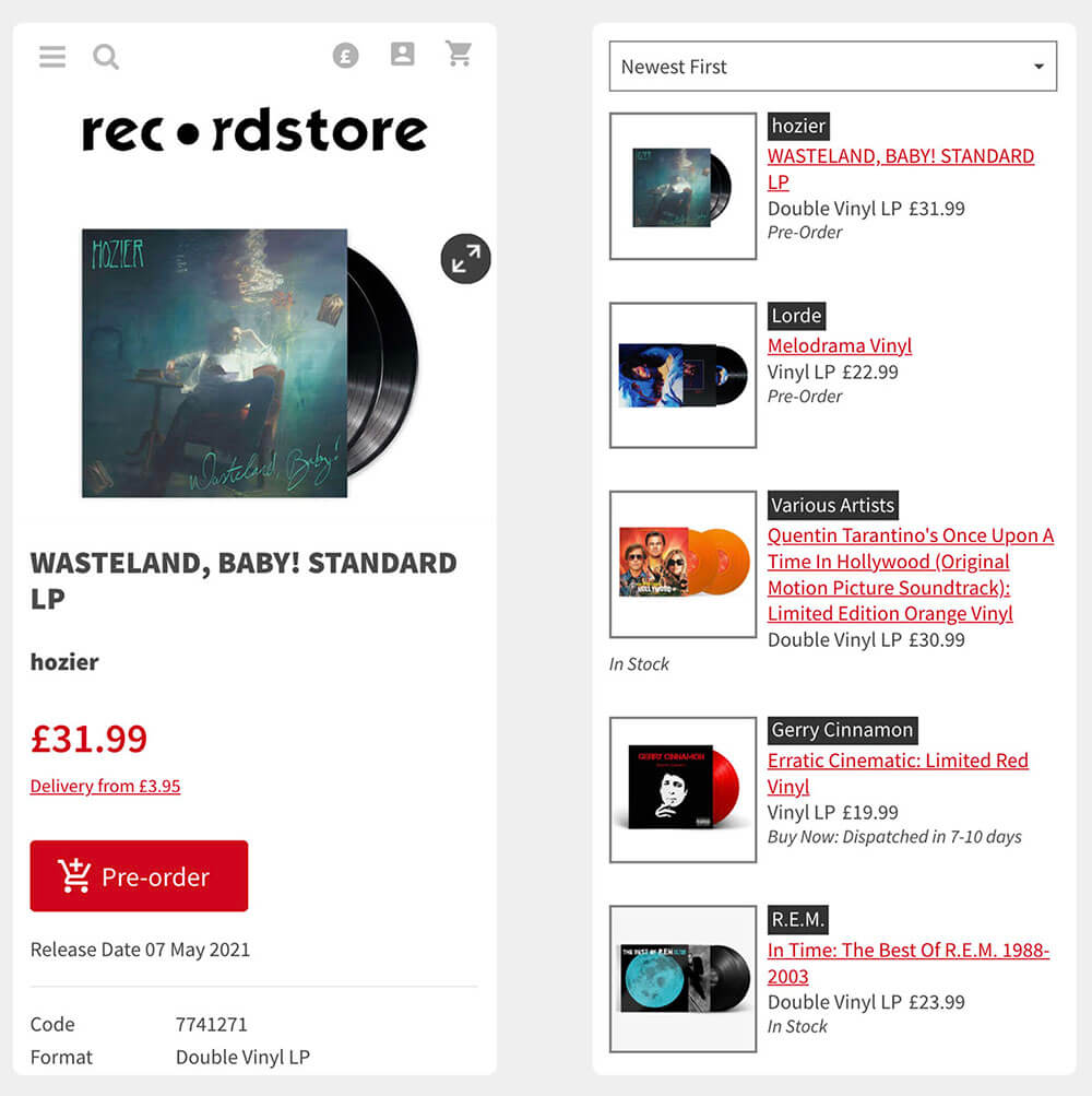
The product page follows the basic e-Commerce layout but could be improved with work on the spacing and typography. The product list on the other hand could use less decorative outlines and underlines and utilise a more up to date grid system, alongside bigger product imagery.
One of the most important aspects of visual design is the photography/imagery used within a layout to sell the product. As humans primarily use sight and visuals to cue their actions, we needed to put more emphasis on images which had issues of duplication, inconsistent perspectives, and sizing.
My first course of action was to set up a library of easy to use templates for the store managers so that their products can start looking more uniform. To ensure they understood how the templates worked I then trained them step by step and gave them guidance when they were unsure.

Changes include:
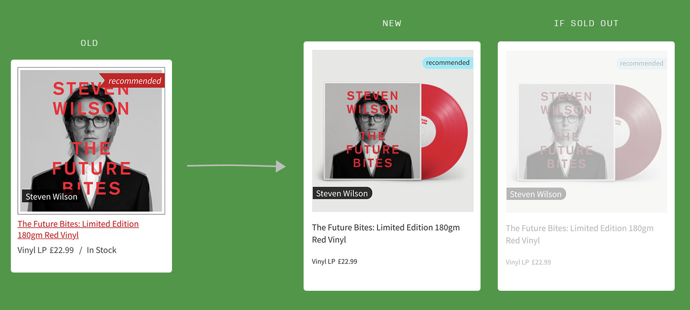
Stripping back the grunge textured top banner and opting for the same shade of neutral grey, the emphasis is now back on the products that we're selling. Changes include:
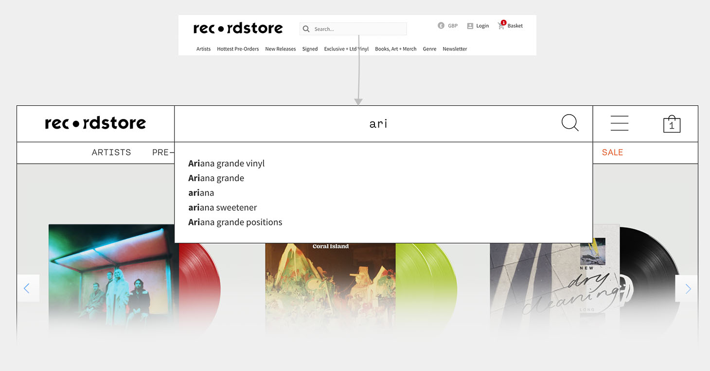
Years' worth of data indicated a large percentile of visitors would interact with the search feature on the homepage to look for artist name, release name, as well as empty searches to display all products available on the shop.
In the new design, we wanted to bring the search to the users attention by increasing the size drastically, in turn also improving accessibility. We also included smart suggestions based on what has been typed.
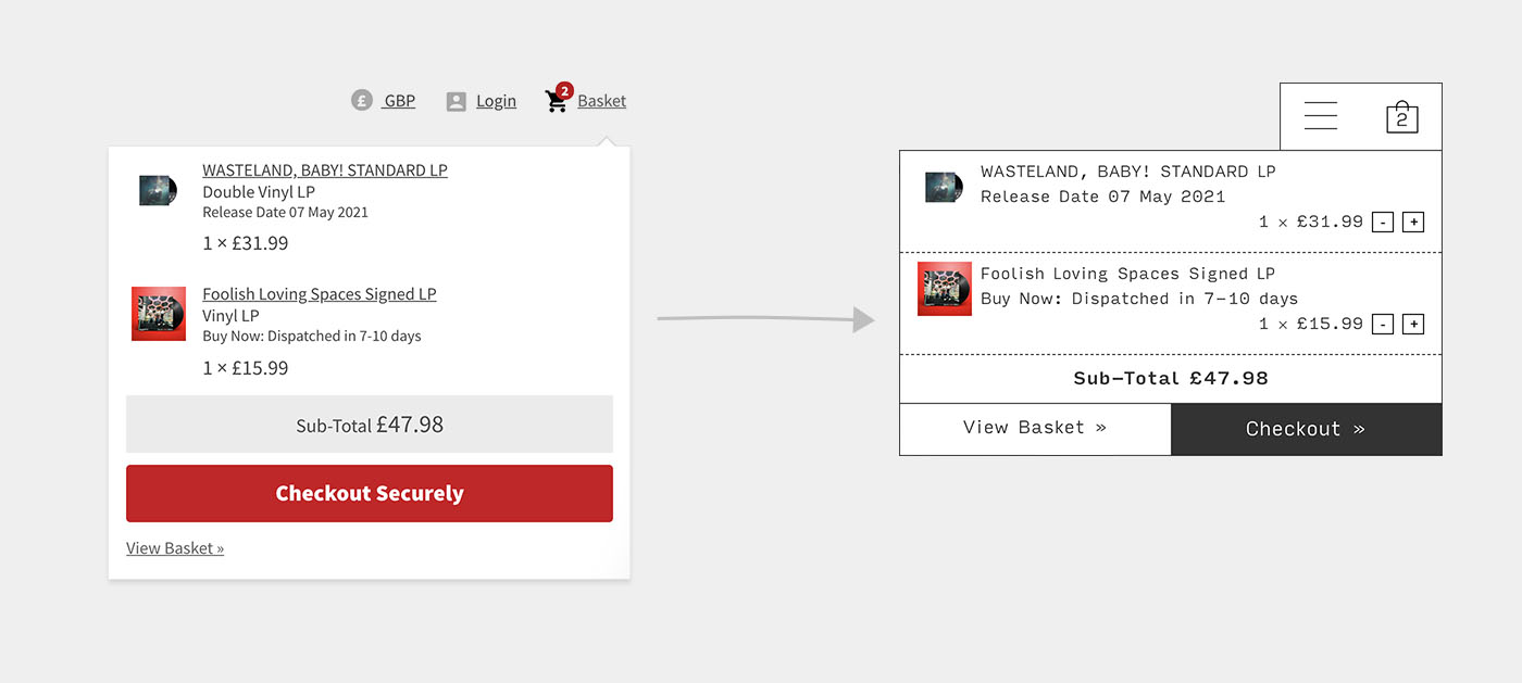
To align with the new navigation style, the mini-cart has been redesigned to sit flush with the new layout. Duplication in information has been removed so the popup can become even more compact.
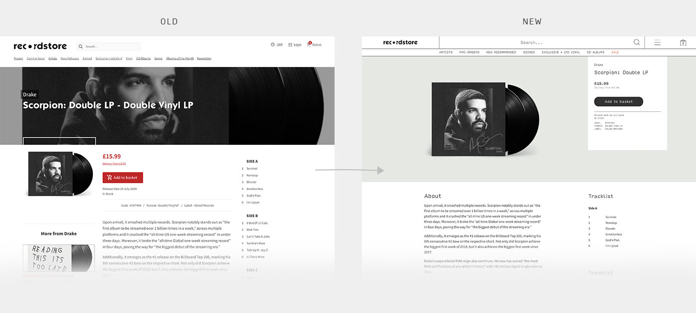
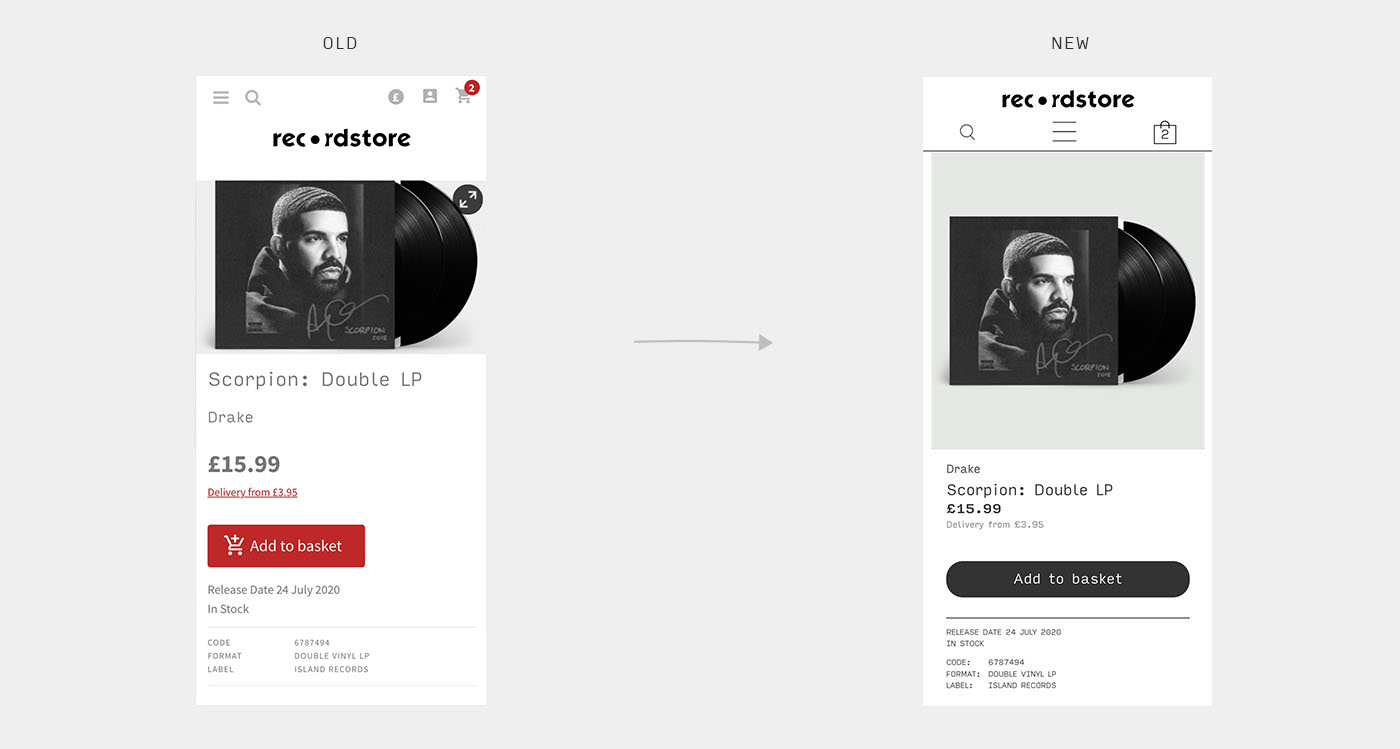
The product page was the second most important area we worked on, after the navigation. Afterall, it is one of the key places of conversion when a visitor lands on the page.
The information hierarchy required a complete rework on the layout to prioritise the most important information in the right order and to remove any cause of confusion.
Both desktop and mobile had a facelift to bring clarity around the product image as well as breathing space around the purchase button. We said goodbye to the angry hot red button.
The product list was already looking fresher with the introduction of the new and improved vinyl and CD templates. Stripping back the top grunge textured banner and opting for the same shade of neutral grey, the emphasis is now back on the products we're selling. Changes include:


I should first thank the store managers and assistants for their patience to understand the importance of good imagery as they were the ones who took on the work to recreate the product imagery you can see in the design.
Spending the time to walk them through the process, putting together the templates, tweaking them, and training the team took the most time in the project, but was completely worth it now that we can see the end result.
As with all projects, many bells and whistles could have been added, but this project demonstrated restraint and good management, as well as willingness to collaborate and compromise to deliver huge improvements in a short amount of time.
This iteration was a good step towards a more modern e-Commerce experience, where the template stands on a CSS grid instead of floats with percentages. The products now stand out amongst the clean and contemporary layout, and the information is in the correct hierarchy.