
About
Dirty Hit is an independent record label based in West London, England, founded in December 2009 by Jamie Oborne, Brian Smith, and Ugo Ehiogu. Their roster primiarly revolves around alternative artists includes The 1975, beabadoobee, PALE WAVES, Wolf Alice and Rina Sawayama.
Brief
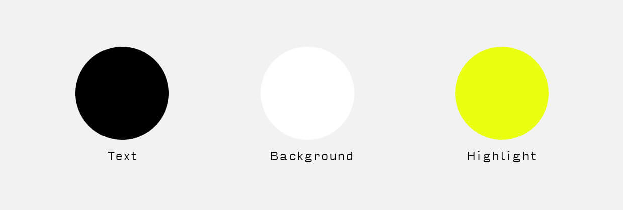
Looking for an extremely minimalist store design to let their artists and products shine, Dirty Hit requested for a sleek and clean layout. Using their current monotone palette, we could take charge of the creative decisions and directions.
- Clean and minimal design to showcase their current products.
- Mobile friendly as their audience primarily uses devices to browse.
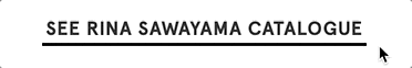
- Ability to customise department/artist pages.
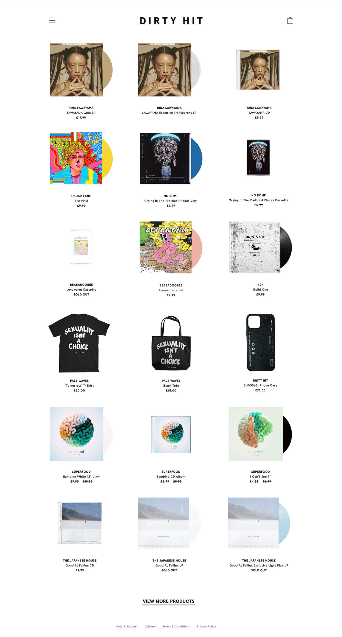
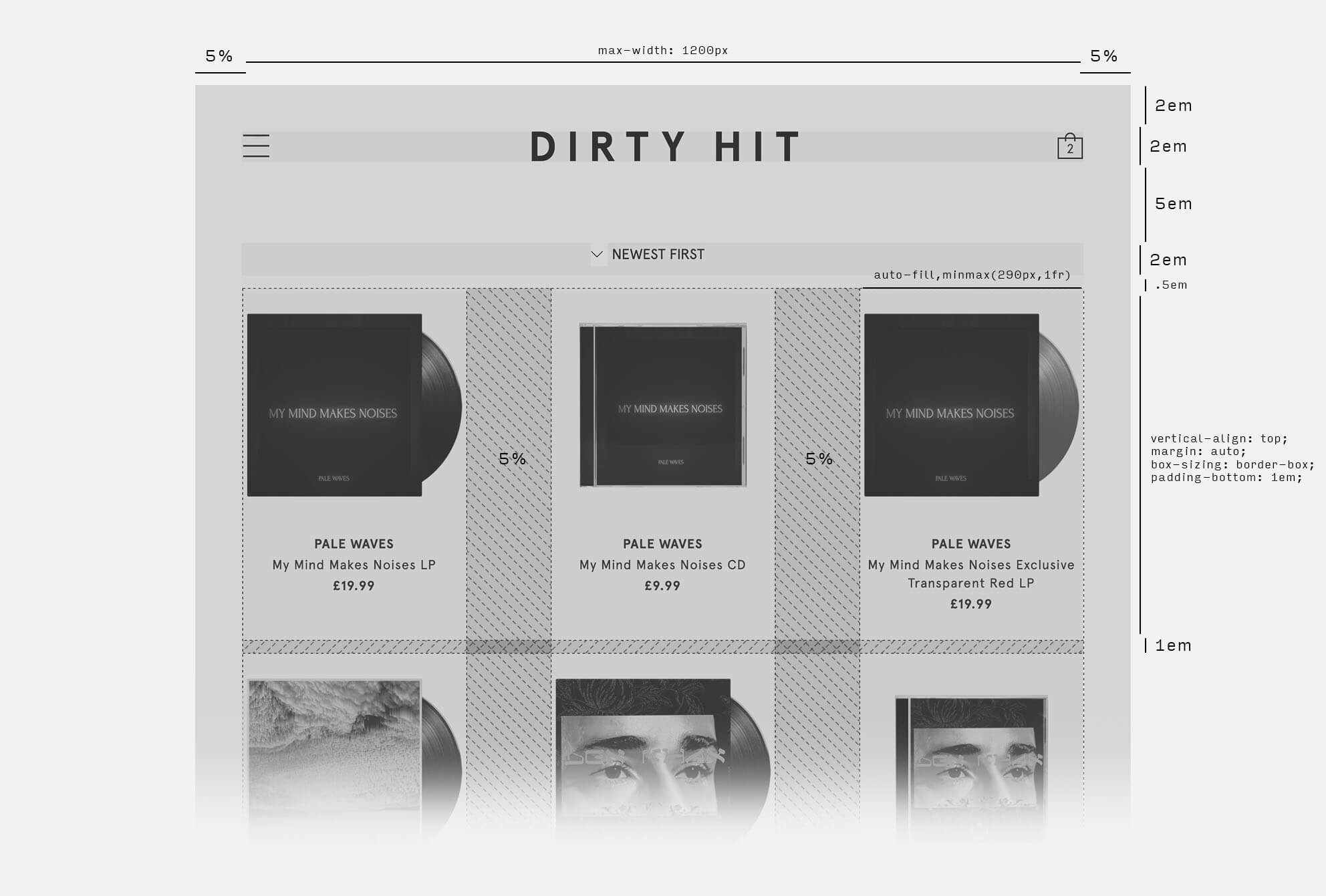
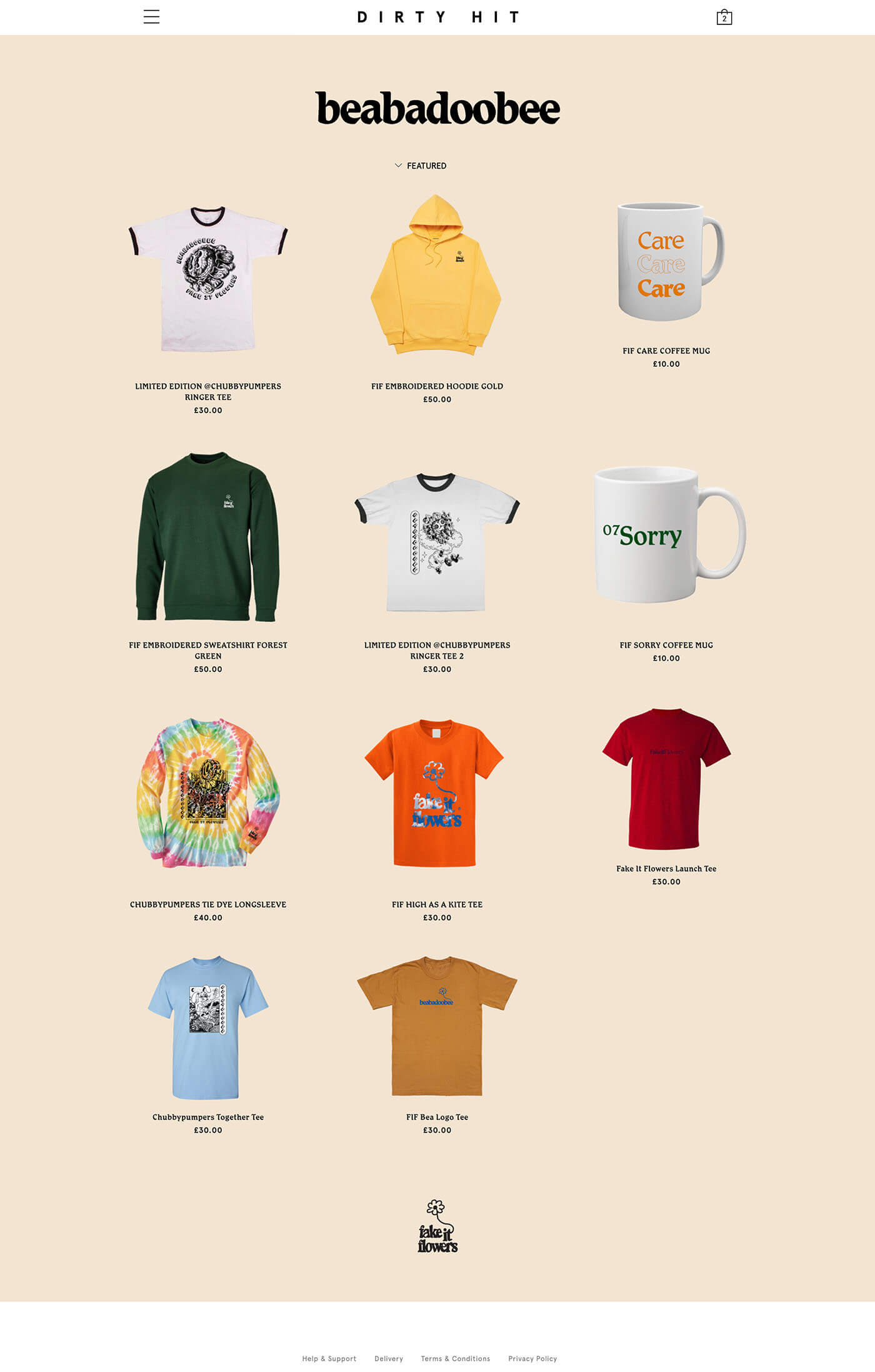
homepage design
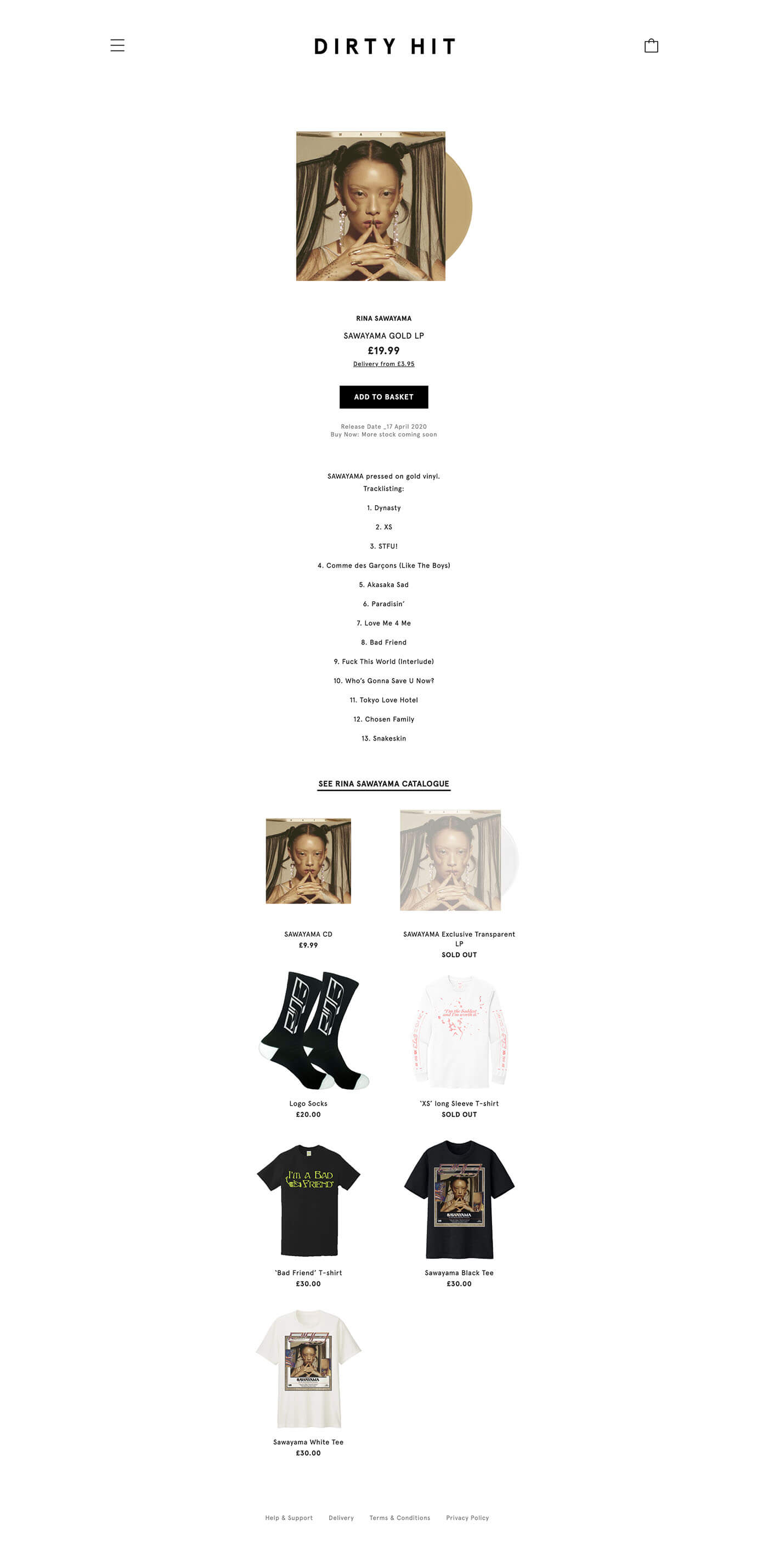
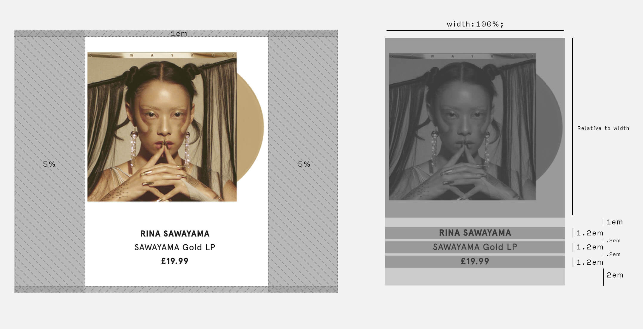
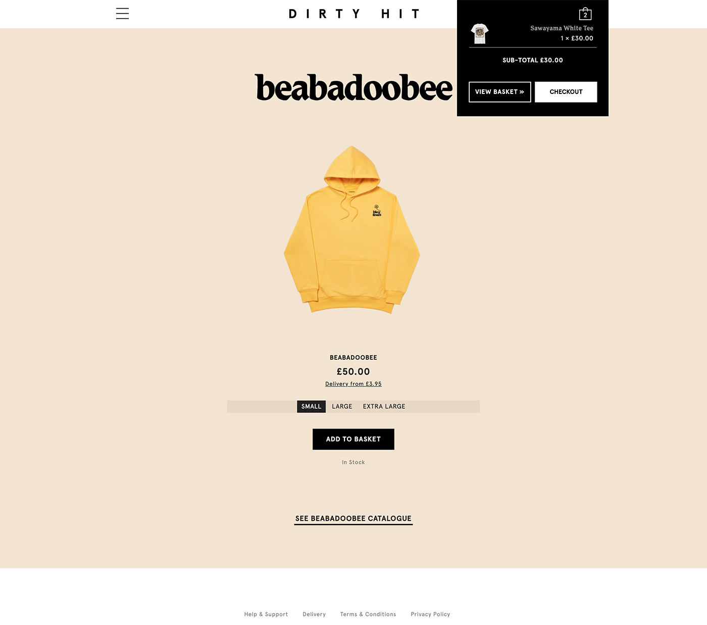
Product page design
Design process
Nowhere to hide
When a website calls for a minimal and stripped back style, there is little for a bad design to hide behind. Areas of faults will echo loudly when a design is very quiet, so we had to pay extra attention to the fundamentals in design, including spacing, colours palette, and most of all, typography. Once the grids and type has been set, we could focus on adding embellishments.
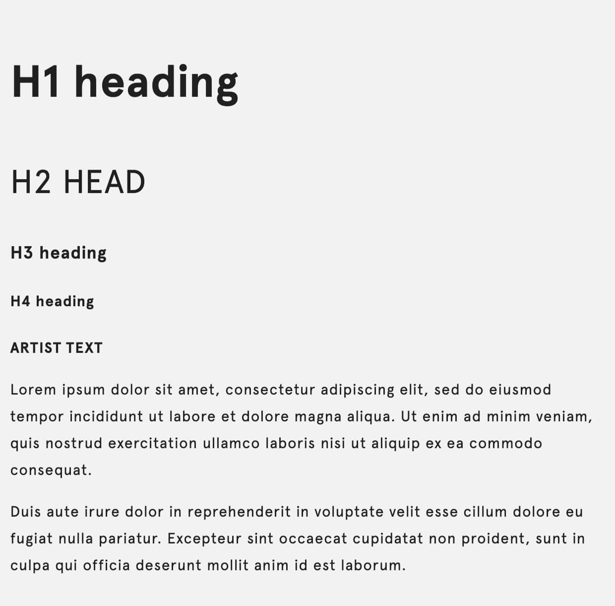
Spacing and typography
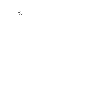
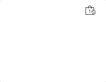
Interactive elements
The beauty of a simple layout allows for each and every element of the page to breath and have it's own space. As well as the spacing, interactivity was key in making a "basic" design feel well thought out.
For this, we focused on animations when users hover and move around the website, revealing animations on the menu, links, and filters.

Result
homepage design
Product page design
Artist page with customisation
Artist product page with customisation
Thoughts and Takeaways
Simple does not neccesarily mean boring! I had a great deal of joy designing this.
Due to it's simplicity in layout and assets, this project took me back to basics and reminded me the importance of good typography and spacing.
Incorporating the subtle animations across the store really bought the design to a new level, and it was one of my favourite projects to work on thus far.